Criteria for Selecting Modern ADA-Compliant Wayfinding and Signage
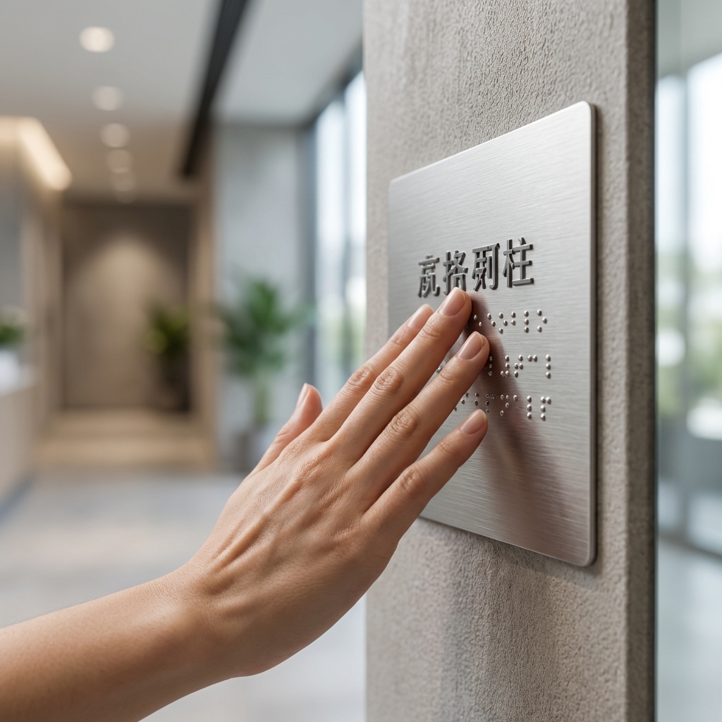
Start with compliance. ADA-compliant wayfinding graphics must pair visual cues with code-required tactile elements. Permanent rooms and spaces still need raised characters and Grade 2 Braille placed in the correct location and height, with non-glare, high-contrast text that’s easy to read. Modern systems blend tactile plaques with large-scale, architectural wayfinding solutions so users get both precision and at-a-glance orientation.
Use a checklist to evaluate vendors and materials:
- Code essentials: compliant tactile/Braille plaques, legible fonts (no decorative scripts), proper character sizing for viewing distance, and non-glare finishes with strong contrast.
- Placement coordination: shop drawings that align plaques with printed arrows, pictograms, and color zones without blocking clear floor space or door swings.
- Durability and cleanability: surfaces that resist scuffs and withstand routine cleaning (including healthcare-grade disinfectants) without ghosting or peeling.
- Lifecycle and flexibility: graphics that can be updated or removed without demolition; paint-over-ready finishes for future tenant or program changes.
- Speed and disruption: installation windows that avoid downtime, with minimal odor, dust, or noise—critical for hospitals, schools, and occupied offices.
- Scale and consistency: standardized palettes, icons, and templates that hold up across multi-building campuses and national portfolios.
- Surface compatibility: reliable execution on drywall, CMU, concrete, and brick to reduce patching or panel backers.
- Sustainability: PVC-free materials and methods that eliminate vinyl waste and reduce replacements.
For organizations seeking institutional branding alternatives to vinyl and wallpaper, direct-to-wall printing can carry the visual layer of your commercial interior signage system while tactile plaques handle code. EastCoast MuralPros prints high-resolution, non-glare, seam-free wayfinding on finished or unfinished surfaces, with durable, cleanable finishes designed for high-traffic corridors. Their on-site process reduces shipping errors, speeds deployment (often under five hours per area), and maintains consistency across multi-location rollouts.
Practical examples include color-coded zones and oversized floor numerals in hospitals to reduce cognitive load, or pictogram-backed wing identifiers and arrows in K–12 corridors to support emerging readers. In offices, wall-scale destination markers at elevator lobbies can declutter sign banks while keeping tactile room IDs adjacent to doors. EastCoast MuralPros coordinates printed layers around code signage to create clear, redundant cues without adding signage clutter.
Finally, weigh environmental impact. Vendors offering sustainable direct-to-wall printing solutions that avoid PVC and adhesives deliver lifecycle efficiency and fewer replacements—key for campuses managing ongoing updates through subscription-based refreshes.
Direct-to-Wall Printing: The Best Solution for Large-Scale Visual Cues
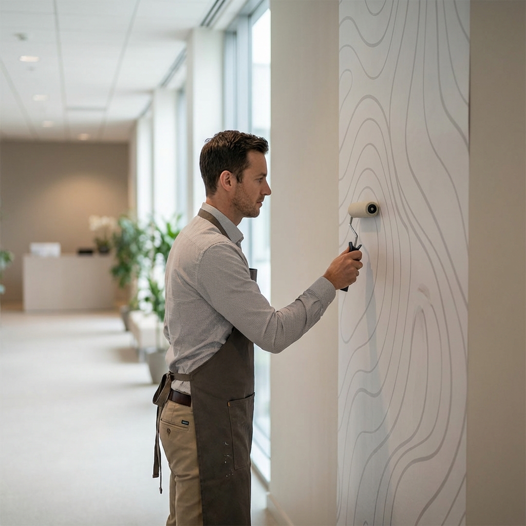
When you need large, legible direction at scale, ADA-compliant wayfinding graphics work best when they are integrated directly into the architecture. Direct-to-wall printing makes corridors, lobbies, and stair cores readable from a distance with oversized arrows, zone colors, and pictograms—without seams, panels, or adhesives that can fail in high-traffic areas. This approach fits the realities of schools, hospitals, and commercial offices where clarity, durability, and cleanability are non-negotiable.
Under ADA rules, directional and informational graphics must provide high contrast, appropriate character size for viewing distance, and non-glare finishes; tactile and Braille are required for permanent room identification, not directional aids. That means you can print the big visual cues directly on walls and pair them with small, code-compliant plaques at doors. For example, a hospital can run color-coded “Cardiology – Blue” bands along a main corridor and use printed arrows at decision points, while room ID plaques carry tactile/Braille at the correct height.
Compared with vinyl wall coverings or wallpaper, direct-to-wall printing delivers photoreal, durable wall graphics that won’t peel, bubble, or telegraph seams. Prints adhere to finished and unfinished substrates—including drywall, CMU, concrete, and brick—and are designed to be cleaned in busy environments. In a K–12 stairwell, floor-to-ceiling numeral graphics and mascots can signal floors and zones without adding protruding signage or maintenance risk.
Speed matters in occupied buildings. On-site production typically completes in under five hours per zone, eliminating shipping delays and mismatches common with fabricated commercial interior signage. For multi-site rollouts, consistency is easier to maintain when art, color values, and typographic specs are printed in-place across a full campus or portfolio.
Best practices for using direct-to-wall printing within ADA parameters:
- Choose matte, non-glare finishes and strong light–dark contrast.
- Size characters to match viewing distance and corridor width.
- Reserve tactile/Braille for room IDs and life-safety locations; maintain consistent mounting heights.
- Use repeated cues at decision points—arrows, color bands, and pictograms—so routes remain intuitive.
EastCoast MuralPros specializes in architectural wayfinding solutions that merge large-scale visual cues with code-required plaques where needed. The team’s fast, adhesive-free process supports hospitals, school districts, and workplaces with durable, cleanable surfaces, subscription refreshes for seasonal updates, and seamless execution across national rollouts. For collaborative workflows with design teams on architectural and large format graphics, see their process overview at architectural and large format graphics.
Tactile Signage Integration for Comprehensive ADA Accessibility
Tactile elements are essential to a truly accessible system, and they must work in concert with your ADA-compliant wayfinding graphics—not compete with them. The most effective approach pairs high-visibility, direct-to-wall printing for directional cues with code-compliant tactile plaques for room identification and critical life-safety locations. EastCoast MuralPros designs wall graphics to reserve clear, high-contrast “installation zones” so tactile signs can be mounted correctly without visual clutter, creating a unified architectural wayfinding solution that looks intentional and performs reliably.
Code considerations drive the details. Permanent room signs, restrooms, and exits require raised characters (minimum 1/32-inch), Grade 2 Braille, non-glare surfaces, and adequate contrast between characters and background. Tactile signs mount on the latch side of the door, with the baseline of the tactile characters between 48 and 60 inches above the finished floor; pictograms need a 6-inch-high field with text descriptors below. Stair enclosures require tactile floor and stair identification inside the stair, and elevators need tactile floor designations at the jambs. EastCoast MuralPros aligns printed wall fields and sightlines so these plaques sit in consistent, compliant locations across corridors, campuses, and multi-building portfolios.
A practical integration checklist many facilities teams use:
- Reserve solid, non-patterned color blocks behind plaques to preserve contrast and non-glare requirements.
- Standardize mounting zones at 48–60 inches AFF and at door latch-side clearances; avoid obstructing door swings and protrusions.
- Use printed color bands, arrows, and zone naming to guide flow; keep tactile content to ID and life-safety elements.
- Include stair, elevator, restroom, and mechanical room IDs; specify tactile size and typographic rules (uppercase, sans serif).
- For elevators, include tactile floor designations at jambs; for stairs, include tactile floor level and discharge notation inside the enclosure.
- Document locations and sign schedules for consistent execution in national rollouts.
Because the printed layer is installed quickly and without adhesives, EastCoast MuralPros delivers durable wall graphics that are cleanable, seam-free, and easy to update while leaving tactile plaques undisturbed. In hospitals, color-coded wall bands speed orientation while tactile room IDs meet clinical compliance. On K–12 campuses and in commercial offices, subscription refreshes keep branding current while tactile signage remains constant—an institutional branding alternative that reduces lifecycle costs and disruption compared to traditional commercial interior signage.
Full-Campus Wayfinding Strategies for Healthcare and Medical Facilities
Hospitals and medical campuses demand ADA-compliant wayfinding graphics that guide patients, staff, and visitors with zero ambiguity—without introducing clutter or disrupting care. The most effective programs blend code-required tactile plaques with large-format, high-contrast environmental cues that are easy to scan under stress. Direct-to-wall printing enables architectural wayfinding solutions at scale, delivering seam-free, durable wall graphics that read clearly from distance and integrate with existing commercial interior signage systems.
Start with ADA fundamentals: high contrast, non-glare finishes, and legible typography sized for viewing distance. Use printed directional cues and destination markers to support navigation, while placing tactile and Braille signs at permanent rooms and doorways where the ADA requires raised characters. EastCoast MuralPros routinely coordinates printed systems with code-compliant plaques, ensuring visual continuity across corridors, elevator lobbies, and departments without compromising regulatory needs.
Color- and pattern-coding streamlines multi-building healthcare environments. Assign each service line a distinct palette and icon set—e.g., blue for Cardiology, amber for Imaging, green for Pediatrics—and apply consistent door bands, wall panels, and elevator-core wraps that are readable from 30–60 feet. Photoreal or illustrative cues can reinforce destinations (“MRI Suite,” “Infusion,” “Family Waiting”) while maintaining sufficient contrast for low-vision users.
Tactics that work well in clinical settings:
- Clarify entry sequences with large, high-contrast department identifiers and universally recognized pictograms.
- Reinforce decision points at intersections with vertical wall bands and arrows placed within typical sightlines and clearances.
- Use corridor “distance markers” (e.g., 50 ft increments) to orient visitors and support staff workflows.
- Pair printed walls at door groups with ADA tactile/Braille plaques to close the compliance loop without signage clutter.
Operationally, direct-to-wall printing minimizes disruption—ideal for occupied patient floors. EastCoast MuralPros completes most zones in under five hours, prints on finished or unfinished surfaces (drywall, CMU, concrete, brick), and delivers cleanable, high-resolution graphics that stand up to routine maintenance. On-site production eliminates shipping delays and fabrication errors, while a subscription model lets facilities update programs seasonally or after department moves—an institutional branding alternative that scales across hospitals, ambulatory clinics, and full campuses with consistent execution.
High-Durability Instructional Graphics for High-Traffic School Environments
School corridors, cafeterias, and gyms demand ADA-compliant wayfinding graphics that can withstand constant traffic, custodial cleaning, and student wear-and-tear. The goal is to make navigation, safety, and instructional cues unmistakable without adding sign clutter or creating maintenance headaches. High-contrast, glare-free visuals that read at a glance are especially useful during passing periods, drills, and events when spaces are at their busiest.
EastCoast MuralPros uses direct-to-wall printing to deliver durable wall graphics that are seamless, cleanable, and designed for high-traffic environments. Installations are typically completed in under five hours with minimal disruption to class schedules, and on-site printing eliminates shipping delays or fabrication mismatches. The paint-over-ready finish supports future curriculum or program changes, avoiding the removal damage associated with vinyl.
For compliance, most schools pair printed directionals with code-required tactile plaques at permanent rooms. EastCoast MuralPros coordinates wall-based commercial interior signage for visibility—then complements it with tactile/Braille door signs where needed. Best practices include 70%+ color contrast between text and background, matte finishes to control glare, clear sans-serif type with adequate x-height, and consistent placement along decision points so routes are intuitive for all users.
Practical campus applications include:
- Color-zoned wayfinding by grade or building wing, reinforced with simple pictograms.
- Corridor directionals to nurse, main office, counseling, gym, library, and accessible restrooms.
- Safety and instructional graphics: evacuation routes, shelter-in-place areas, AED locations, and lab PPE reminders.
- Cafeteria queue and allergy-zone delineation to improve flow and reduce risk.
- Bilingual cues and QR codes for supplemental audio or language support (as a complement to tactile signage, not a replacement).
Compared with vinyl and wallpaper, this institutional branding alternative delivers lifecycle efficiency. Surfaces resist daily cleaning agents, won’t peel or bubble at seams, and can be refreshed on a subscription cadence to align with policy changes or seasonal programs. For districts managing multiple schools, EastCoast MuralPros provides architectural wayfinding solutions that scale consistently across campuses, ensuring standardized specifications and predictable results.
Direct Printing vs. Traditional Vinyl: A Performance and Maintenance Comparison
For ADA-compliant wayfinding graphics, the production method impacts legibility, durability, and lifecycle cost. Traditional vinyl wall coverings rely on adhesives and seams, which can interrupt type, arrows, and pictograms. Direct-to-wall printing creates continuous, high-resolution visuals at architectural scale, helping sighted users track color-coded paths, floor numbers, and zone IDs without panel breaks or bubbling.
Both approaches can support ADA legibility rules for directional and informational signs when designed with adequate contrast and clear typography. However, permanent room identification still requires tactile characters and Grade 2 Braille plaques; large-format wall graphics should be paired with code-compliant plaques at doorways and critical decision points. In schools and hospitals, this hybrid approach yields intuitive circulation—think color bands and icons that lead to Pediatrics or 200-Level Classrooms—while plaques deliver tactile compliance.
Key differences that affect performance and maintenance:
- Seam-free imagery: Direct printing removes panel seams that can misalign arrows or pictograms over time.
- Surface compatibility: Printing directly to drywall, CMU, concrete, and brick enables consistent visuals in stair towers, masonry corridors, and unfinished back-of-house zones where vinyl struggles.
- Speed and disruption: On-site direct-to-wall printing minimizes staging, shipping, and rework, often completing corridors or elevator lobbies in a single session.
- Cleaning and wear: With no edges to lift, durable wall graphics resist snagging and routine cleaning that can degrade vinyl adhesives.
- Lifecycle efficiency: Paint-over-ready finishes simplify future tenant or program changes without scraping residual adhesive.
For architectural wayfinding solutions across a full campus, direct-to-wall printing also standardizes color systems, iconography, and floor identifiers across multiple buildings. In a healthcare tower, for example, EastCoast MuralPros can print concise patient pathways from lobby to imaging, integrate safety cues at intersections, and refresh seasonal messaging via a subscription model—without disrupting operations or waiting on fabricated panels.
As an institutional branding alternative to wallpaper and commercial interior signage panels, EastCoast MuralPros delivers high-resolution, durable wall graphics with predictable rollout schedules across multi-location portfolios. Pair their direct-to-wall printing with code-compliant tactile plaques to meet ADA requirements comprehensively while elevating clarity, speed of installation, and long-term maintainability.
A Buyer’s Guide to Implementing Scaleable Wayfinding for Corporate Interiors
Building a scalable program for ADA-compliant wayfinding graphics starts with aligning code, brand, and operations. Treat wayfinding as a repeatable system—not a one-off project—so it can expand floor by floor, building by building. Define the program’s goals (e.g., faster visitor flow, safety communication, brand consistency) and the metrics you’ll use to assess success.
Begin with an audit. Gather floor plans, circulation patterns, and high-friction zones (e.g., lobbies, elevator cores, intersections). Inventory existing commercial interior signage and identify conflicts, redundancies, or glare/contrast failures. Map audiences by task—employees, visitors, vendors—and document the decision points each group encounters.
Bake in ADA from the start with clear, testable criteria:
- High visual contrast and non-glare finishes for visibility under varied lighting
- Character heights and stroke widths appropriate to viewing distances
- Legible typefaces (simple sans-serif or humanist) and consistent pictograms
- Tactile raised characters and Grade 2 Braille for room/space identification at doors
- Logical placement heights and clear floor- and room-numbering conventions
Design the information hierarchy before aesthetics. Establish levels (orientation maps, decision signs, confirmation cues) and standardize type scales and color coding by floor, zone, or program. Use universally recognized symbols, multilingual support where needed, and reassurance markers after major turns. In large offices, pair elevator-core “you are here” maps with corridor “breadcrumb” graphics to reduce cognitive load.
Select production methods that meet performance and speed requirements. Direct-to-wall printing produces durable wall graphics with crisp, seam-free results and eliminates vinyl seams, adhesives, and long lead times. It also enables architectural wayfinding solutions on finished and unfinished substrates without visible panel edges. Pair printed systems with code-required tactile plaques at doorways for a complete, compliant package.
Plan implementation in phases: pilot a floor, validate legibility in real lighting, then scale. For occupied buildings, prioritize low-disruption installation. EastCoast MuralPros prints on-site—often in under five hours per area—delivering cleanable, high-resolution graphics without shipping delays or fabrication errors, a strong institutional branding alternative to traditional wallpaper or vinyl.
Sustain the program with standards and governance. Build a kit-of-parts, asset library, and naming/numbering logic that procurement and facilities can use across locations. For frequent changes—new departments, amenities, or policies—consider a subscription model with scheduled refreshes. EastCoast MuralPros supports multi-location rollouts and campus-wide updates with consistent execution and paint-over-ready finishes for future changes.
Call to Action
Contact us to learn more